- The eBay Canada Community
- Discussion Boards
- Community News and Information
- Community Feedback
- Re: New Community Platform
- Subscribe to RSS Feed
- Mark Topic as New
- Mark Topic as Read
- Float this Topic for Current User
- Bookmark
- Subscribe
- Mute
- Printer Friendly Page
New Community Platform
- Mark as New
- Bookmark
- Subscribe
- Mute
- Subscribe to RSS Feed
- Permalink
- Report Inappropriate Content
01-09-2018 05:27 PM
Hi all,
Welcome to the newest version of your Community platform. I see that some of you are already posting away, and to those who may have experienced some hiccups earlier during the rollout process, thanks for your patience.
Let's use this discussion thread as a hub for constructive feedback and questions about the upgrade. Most of your day-to-day functions should remain the same, but if you can't find or feature, or want to know how to use some of the new ones, we'll help you out as best we can.
- Labels:
-
Community
-
new platform
-
update
-
upgrade
Re: New Community Platform
- Mark as New
- Bookmark
- Subscribe
- Mute
- Subscribe to RSS Feed
- Permalink
- Report Inappropriate Content
01-11-2018 11:25 PM
@happy_pigeon wrote:
@happy_pigeon wrote:
@pocomocomputing wrote:
Spellcheck. Sigh. I have been complaining about spellcheck in these forums on eBay.ca before Lithium took over and on eBay.com USA since 2013!
VERY interesting post, pocomo, thank you. So just to clarify my understanding based on this and your post over on .com, it would be your preference to turn off the Lithium-based spellcheck in favour of whatever browser-based spellchecking system the member might have in place?
Aaaand done. You're welcome
That said, if I see a SINGLE person with a flaming torch outside of headquarters over this, I will be toggling it back.
Wow, 5 years of complaining and you fix it in less than 24 hours. I am impressed.
Now if you are really that good, fix the spellcheck on the eBay.com forums for the body of a post.
Seriously, thanks for fixing it.
Re: New Community Platform
- Mark as New
- Bookmark
- Subscribe
- Mute
- Subscribe to RSS Feed
- Permalink
- Report Inappropriate Content
01-11-2018 11:42 PM
@happy_pigeon wrote:
@pocomocomputing wrote:
Spellcheck. Sigh. I have been complaining about spellcheck in these forums on eBay.ca before Lithium took over and on eBay.com USA since 2013!
VERY interesting post, pocomo, thank you. So just to clarify my understanding based on this and your post over on .com, it would be your preference to turn off the Lithium-based spellcheck in favour of whatever browser-based spellchecking system the member might have in place?
My preference is using the browser spellcheck. But for those users who do not use a browser spellcheck (rare in my opinion), you could leave the Lithium spellcheck on the reply editing toolbar. I think it would be very rare that a user would run both. I do not think it would be an issue to have both available.
Re: New Community Platform
- Mark as New
- Bookmark
- Subscribe
- Mute
- Subscribe to RSS Feed
- Permalink
- Report Inappropriate Content
01-12-2018 12:10 AM
Let's talk about Groups on eBay.ca. Most groups are dead. Please delete Groups that have no activity since created. Some members set up a group when the new Lithium forum were introduced and they were never used again. Many are from 2013 and 2014.
I would suggest deleting all inactive groups with 0 or only the first post if 2+ years old.
Next, the member My Settings -> Preferences -> Home Page
Home Page Settings customize option is a disaster. eBay forums are mixed in with Group forums alphabetically and so confusing to make sense of that page. All groups have a Welcome to eBay Groups forum so the same Welcome is shown repeatedly with no way to identify what group it is. I would suggest deleting all the Welcome to eBay Groups from the customize list since they offer no useful information and cannot be posted to.
The organization of the Home Page Settings is poor. The Answer Center, the Discussions and the Groups are all on that page intermixed together sorted alphabetically. There is no way for a member to select a forum without knowing them. If the same forum name is used, there is no way to distinguish it from the other. I would suggest that the Home Page be broken down into three main sections of the community, one for the Answer Center, one for the Discussions and one for Groups.
This issue came up in the eBay.com forums and they cleaned it up but the breakdown by sections was not introduced. Perhaps you can do this as it would make the Home Page Settings much better and easier to use.
Re: New Community Platform
- Mark as New
- Bookmark
- Subscribe
- Mute
- Subscribe to RSS Feed
- Permalink
- Report Inappropriate Content
01-12-2018 12:17 AM
In My Settings -> Macros, only 9 macros allowed. Pitifully small when compared to eBay.com USA which has 100 available. Increase to 25 or 50 or 100.
Re: New Community Platform
- Mark as New
- Bookmark
- Subscribe
- Mute
- Subscribe to RSS Feed
- Permalink
- Report Inappropriate Content
01-12-2018 04:13 AM
It's really hard to read because I have to scroll every 10 seconds. There's hardly any text on my 22 inch screen for crying out loud, and the text is normal size so that's not the problem. Also I hate white background all over because it makes me too aware of the floaters in my eyeballs.
When I look at the list of threads/topics, there's only three on the 22 inch screen, garbage, no fun to look at. Back to doing **bleep** in the world I guess.
summary: I need the text to be way more condensed so I don't have to scroll so much to read anything substantial.
Re: New Community Platform
- Mark as New
- Bookmark
- Subscribe
- Mute
- Subscribe to RSS Feed
- Permalink
- Report Inappropriate Content
01-12-2018 08:46 AM
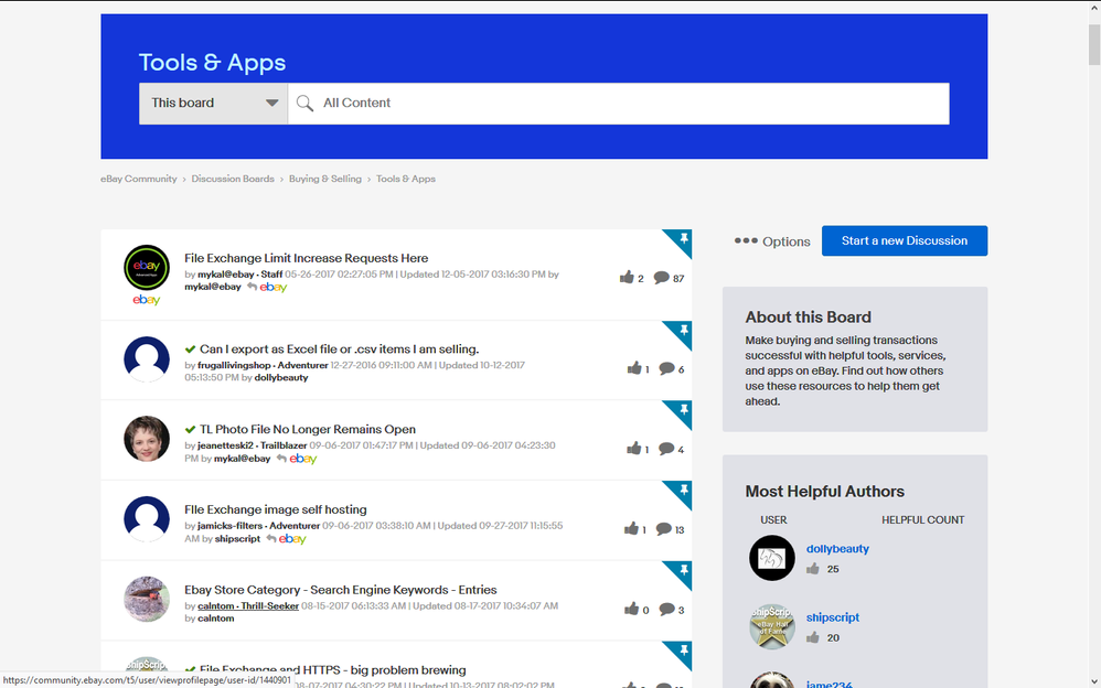
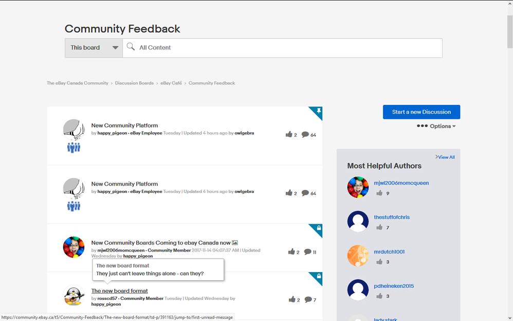
One feature on the eBay.com forums is a short explanation of the purpose of a forum. It is called "About this Board". Here is a screenshot from the eBay.com USA forums. I find this feature to be useful and informative as to the purpose of the board. It is most likely very helpful for new forum members to know where to post their questions.
The eBay.ca forums look like this with no "About this Board" at all showing.
Re: New Community Platform
- Mark as New
- Bookmark
- Subscribe
- Mute
- Subscribe to RSS Feed
- Permalink
- Report Inappropriate Content
01-12-2018 08:59 AM
Hey all, thanks for keeping the thread going. There's been quite a few more points of feedback, so I'm going to try to summarize instead of quoting everyone, and let me know if I miss anything.
Older business: A few people were asking about location. I did ask Lithium, and was told it would require research to determine what would be involved. I'll let you know when I know more, but if there is a lot involved, it may end up being a "save for the next round of updates" feature.
@thestuffofchris: Notification bell hover. That one would definitely be a deeper change along the lines of the Location request, unfortunately not something I can turn on myself like your last request ![]() So I might be 1/2 on this one, but I want to put it in writing so that if I can get budget for future enhancements, it's considered.
So I might be 1/2 on this one, but I want to put it in writing so that if I can get budget for future enhancements, it's considered.
@fashionoutletdeal: I hear that you are not happy. It's not great to hear that, since it looks like you're a pretty active poster around the forums. The post size thing is tricky because it would require a complete redesign of the template to change, so while it may not be what you want to hear, it is probably not a change that's in the cards.
The white background and the fact that the text is less condensed is actually an accessibility thing. Lower contrast means those with disabilities, such as sight impairment, may not be able to see the words at all.
@lady.stark: Unread threads/posts: that's super weird - it definitely shouldn't be a special ~*~*~mod power~*~*~~ to be able to see which posts have been read and which are not. I will check with Lithium and possibly the US team on this, but in the meantime, what is the experience of other members with regard to previously viewed/unviewed threads and posts? Do you see any indiction on your side?
@pocomocomputing: Can't help you with the spellcheck on the US forums, that's all Alan ![]() With regard to the browser/Lithium spellcheck, the option is either/or, and unfortunately I can't set it to both. So for now we'll err on the side of what people seem to prefer: browser. I haven't seen any torches yet...
With regard to the browser/Lithium spellcheck, the option is either/or, and unfortunately I can't set it to both. So for now we'll err on the side of what people seem to prefer: browser. I haven't seen any torches yet...
Groups: Love it. Would super love to go nuts deleting unused Groups like a deranged wildebeest.
For the Home page customization settings, let me look at that myself and spend some time with it. This one might end up being a bigger ask that ends up being a future enhancement, but there is sense in it.
Macros: I've now set the maximum number of allowed macros to 100, in keeping with what's allowed on the US community. What's good for the goose...
About this board: Hmmm..... THANK YOU, those are supposed to be there. I do recall writing the darn things during the QA process. Off to Lithium...
I THINK that's everyone...
Re: New Community Platform
- Mark as New
- Bookmark
- Subscribe
- Mute
- Subscribe to RSS Feed
- Permalink
- Report Inappropriate Content
01-12-2018 09:08 AM
Q. "What is the experience of other members with regard to previously viewed/unviewed threads and posts? Do you see any indiction on your side?"
A. If I'm understanding the question correctly, my previously-viewed posts are not in boldface while the New or Unread ones are bold. Sometimes. Also, the ones I've read before are also sometimes again made bold. Unless it's the same member posting multiple topics with the same title, or the same topic getting new views. Or some other factor I'm not fully understanding.
Re: New Community Platform
- Mark as New
- Bookmark
- Subscribe
- Mute
- Subscribe to RSS Feed
- Permalink
- Report Inappropriate Content
01-12-2018 09:10 AM - edited 01-12-2018 09:14 AM
The old eBay.ca forums had a great "index" page to all the forums. I miss it as it gave a quick summary as to the activity on all the forums in one glance. No useless clicking like the current design of endless clicking. I do not have a screenshot of this summary page. Basically it went like this
Discussion Boards
Buying and Selling on eBay
Buyer Central 2955 Posts 3 New
eBay Motors 32 Posts 0 New
eBay Stores 201 Posts 5 New
PayPal 292 Posts 2 New
Seller Central 7082 Posts 16 New
Seller Listing Tools 285 Posts 1 New
User to User Help 1132 Posts 3 New
eBay Café
Canada Town Square 1185 Posts 0 New
Community Feedback 86 Posts 1 New
eBay News and Information
eBay News and Information 53 Posts 3 New
Seller Updates 49 Posts 0 New
Site Issues 616 Posts 2 New
Weekly Chat Session 227 Posts 6 New
The forum titles are hyperlinks to the forum for direct access to seeing the forum and the new posts.
Without the summary page, I will not check each forum individually to check for new activity. This means forum participation will drop drastically on slower forums. Lack of this summary page makes the eBay.com USA forums a horror to monitor and participate.
I can understand that the eBay.com USA forums have many more forums so a summary page is more cluttered. But the eBay.ca Canada forums have very few few forums so it would work fine here.
PS The same summary structure would be nice for the Answer Center and the Groups.
Re: New Community Platform
- Mark as New
- Bookmark
- Subscribe
- Mute
- Subscribe to RSS Feed
- Permalink
- Report Inappropriate Content
01-12-2018 09:13 AM
Regarding my most recent post: one bold title was a duplicate thread, the other bold title was zombie thread.
Re: New Community Platform
- Mark as New
- Bookmark
- Subscribe
- Mute
- Subscribe to RSS Feed
- Permalink
- Report Inappropriate Content
01-12-2018 09:22 AM - edited 01-12-2018 09:25 AM
Another feature of the "About this Board" was that it used to show in the section of a set of forums. This was partially implemented on the eBay.com forums then deleted completely in the most recent version of the eBay.com USA forums. I think it is helpful for new members to know the purpose of the forums. Look at the the screenshot of my first post in this topic I started on eBay.com.
PS Having the "About this Board" added to my suggestion of the quick one page forum summary above would be useful for new (and old) members to know where to post their topic.
Re: New Community Platform
- Mark as New
- Bookmark
- Subscribe
- Mute
- Subscribe to RSS Feed
- Permalink
- Report Inappropriate Content
01-12-2018 09:33 AM
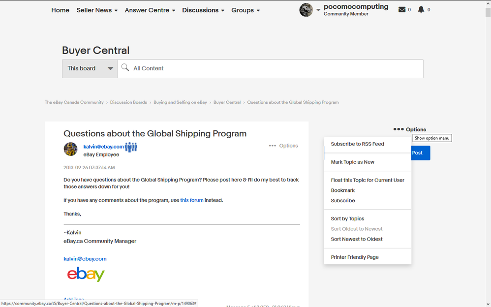
Can you fix the location of the drop down list for Options in a topic when opened. It is to the left, not directly under the Options word. I automatically slide down when I click on Options and end up passing over the Share Post box opening up its drop down list. So ANNOYING. It is like playing Whack-A-Mole trying to get the Options drop down list to show up as it takes me 3-4 tries before I realize the Options drop down list is off to the left and I have to carefully move left to avoid the Share Post box!!!
Re: New Community Platform
- Mark as New
- Bookmark
- Subscribe
- Mute
- Subscribe to RSS Feed
- Permalink
- Report Inappropriate Content
01-12-2018 09:51 AM - edited 01-12-2018 09:56 AM
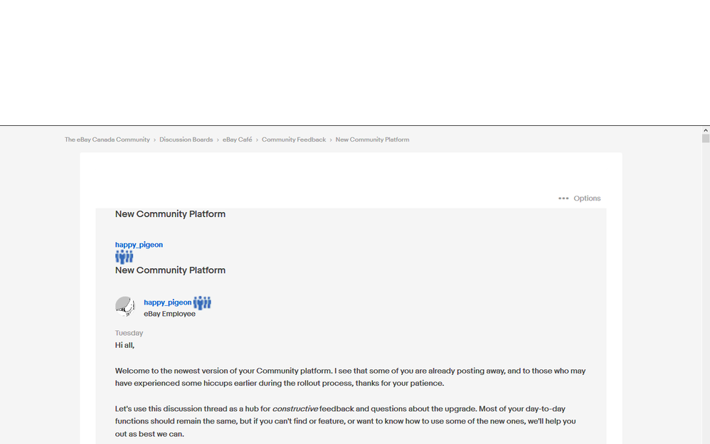
Regarding the issue of too much white space in the forums. When reading a topic, there is an option in the Options drop down list called "Printer Friendly Format". This is so clean to read, free of the right 1/3 of the screen used for Bookmark and Share Post links. It uses the full screen for the topic and moves the Options to the top above the topic. Reply and Options work on that page too. So much better for reading posts.
Why can't this display format be the default for reading a topic? Move the Bookmark and Share Post on the same line as the Options at the top of the page. I do not care at all about the Related Discussions section on the right.
At least make it a member settings option. LOL, you could call it "Eyes Friendly Page"!
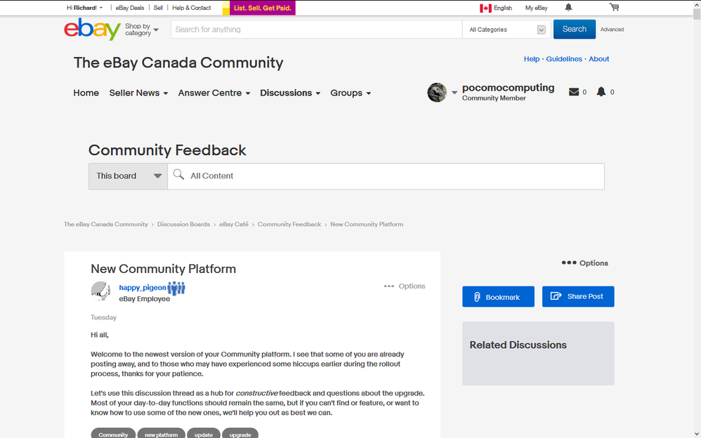
Screenshot of the current display of reading a topic.
Screenshot of the Printer Friendly Page
Even that page has too much white space on the sides but better than the current display.
Re: New Community Platform
- Mark as New
- Bookmark
- Subscribe
- Mute
- Subscribe to RSS Feed
- Permalink
- Report Inappropriate Content
01-12-2018 10:09 AM
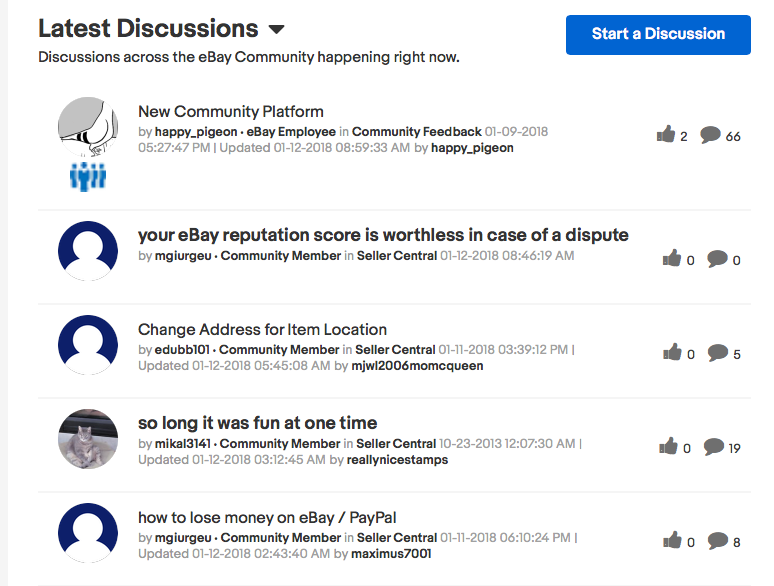
In My Settings -> Preferences -> Display Settings, I have the option for "Display dates as" set to "Relative dates (e.g. three hours ago)". This works fine except when a post is updated, it shows the update date and time ad a date time format, not a relative date. Inconsistent and annoying. Why does it not display as a relative date format.
Screenshot.
Re: New Community Platform
- Mark as New
- Bookmark
- Subscribe
- Mute
- Subscribe to RSS Feed
- Permalink
- Report Inappropriate Content
01-12-2018 10:18 AM - edited 01-12-2018 10:19 AM
@ tagging feature
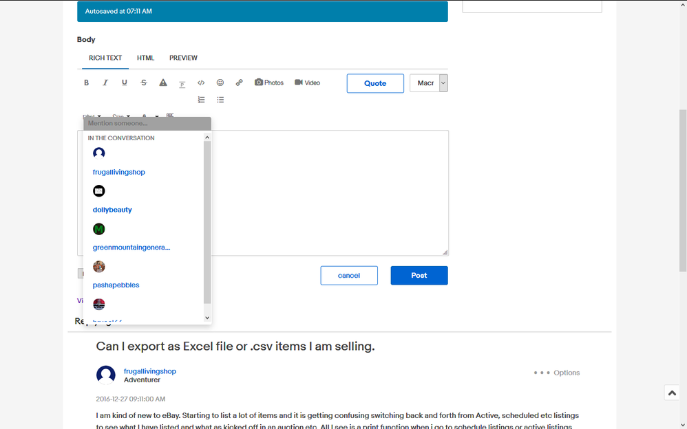
In the eBay.com USA forums, when you are replying to a members post and start to use the @ tagging symbol, it immediately brings up a drop down list of eBay members who posted to the topic being read with the OP (Original Poster) id being first and as you type the member name, it shows the subset of members in the community to select from if they have not posted to the topic. This lookup feature is very nice. Can we have this feature in the eBay.ca Canada forums?
Screenshot of eBay.com USA forum @ tagging drop down list feature.
Re: New Community Platform
- Mark as New
- Bookmark
- Subscribe
- Mute
- Subscribe to RSS Feed
- Permalink
- Report Inappropriate Content
01-12-2018 10:31 AM
In the old forums we had an option in settings to set the font size displayed in the forums. Why not in this version of the forums? I know about the browser Zoom feature but that affects the browser and there was a setting to set the font size for the community platform.
A simple option with the standard browser font size relative values of XX-Small to XX-Large descriptive text would be best instead of choosing a specific font size in points.
Re: New Community Platform
- Mark as New
- Bookmark
- Subscribe
- Mute
- Subscribe to RSS Feed
- Permalink
- Report Inappropriate Content
01-12-2018 10:36 AM
Why is there no Undo or Redo when Replying or Creating a post? I know I can right click and get and Undo option in the drop down list but Undo and Redo should be on the editing toolbar.
Re: New Community Platform
- Mark as New
- Bookmark
- Subscribe
- Mute
- Subscribe to RSS Feed
- Permalink
- Report Inappropriate Content
01-12-2018 11:39 AM
I just want to reiterate that the font size/post size isn't going to change for the time being. I've taken a look, but unfortunately, this isn't a setting that I can easily adjust without there being a code change.
I won't be commenting further on that particular piece of feedback in this thread for now and will be focusing on other feedback that I can potentially action. However, people should continue to put their two cents in about it if they'd like to, so that I have a good idea of how many support it if/when the times comes that we might be able to revisit it.
Re: New Community Platform
- Mark as New
- Bookmark
- Subscribe
- Mute
- Subscribe to RSS Feed
- Permalink
- Report Inappropriate Content
01-12-2018 11:41 AM - edited 01-12-2018 11:42 AM
@pocomocomputing wrote:
@ tagging feature
@In the eBay.com USA forums, when you are replying to a members post and start to use the @ tagging symbol, it immediately brings up a drop down list of eBay members who posted to the topic being read with the OP (Original Poster) id being first and as you type the member name, it shows the subset of members in the community to select from if they have not posted to the topic. This lookup feature is very nice. Can we have this feature in the eBay.ca Canada forums?
Yes, that feature is also activated on the Canadian forums - in my lengthy post a few posts up, I "atted" several people, including yourself. Do you not see the dropdown when you type the '@' symbol and begin typing a username? If not, it may be a permissions issue that I can have fixed.
Edit: Apologies, it may have been disabled for users at large. I've enabled it, so give it a try now.
Re: New Community Platform
- Mark as New
- Bookmark
- Subscribe
- Mute
- Subscribe to RSS Feed
- Permalink
- Report Inappropriate Content
01-12-2018 01:06 PM

